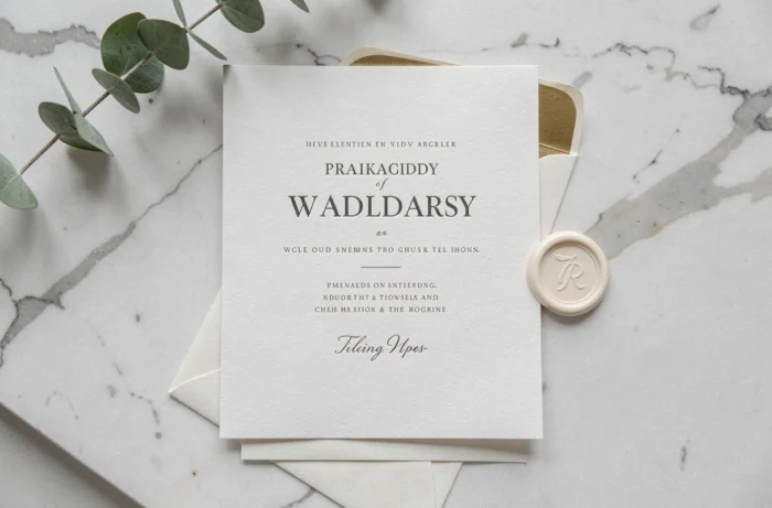
A simple and refined wedding invitation relies on a precise balance between graphic purity and material quality. The choice of paper, typography, and layout shapes the first impression that guests have of the ceremony. Reducing visual elements to the bare minimum does not mean impoverishing the design, but rather prioritizing each detail so that it carries more meaning.
Paper weight and texture: the foundation of a refined invitation
Before considering colors or fonts, the physical medium determines the tactile perception of the invitation. A paper that is too thin gives an impression of fragility, while a sufficiently dense weight immediately conveys a sense of quality.
Cotton paper, recognizable by its slightly irregular edges, offers a soft texture without added patterns. Vellum, smooth and luminous, is suitable for minimalist designs where typography does all the work. Kraft, more raw, works for weddings with a natural tone, provided a contrasting ink is chosen.
Browsing through the wedding ideas on Mariages Chics, one finds this logic of coherence between the medium and the atmosphere of the ceremony.
- Textured paper (laid, felted) stands on its own and supports little ink to remain legible.
- Recycled paper works well with monochrome printing and an airy layout.
- Pearlescent or metallic paper adds relief without resorting to gilding, but requires a sober typography to avoid overload.

Sober typography for wedding invitations: serif, sans-serif, and calligraphy
Typography represents the first visible graphic choice. On a simple invitation, it fills the role that illustrations or ornaments would play elsewhere.
Two font families that work in tandem
A serif and sans-serif combination remains the most reliable pairing. The serif font carries the names of the couple, while the sans-serif manages the practical information: date, location, time. This contrast creates a natural visual hierarchy without multiplying decorative elements.
Handwritten calligraphy, used sparingly on one or two words, can replace the serif for the names. A common mistake is to apply a calligraphic font to the entire text, which harms readability.
Typographic accessibility, a often overlooked criterion
Recent sources highlight the importance of providing sufficient contrast between ink and background, even a large font version for visually impaired guests. Accessibility enhances elegance rather than limits it, because it imposes clear graphic choices: light background, dark text, generous font size.
Minimalist color palette: three shades maximum
A refined invitation generally does not exceed three colors. The operational rule is simple: one dominant shade (the background), one secondary shade (the main text), one accent shade (a border, a monogram, a detail).
Off-white paired with anthracite gray and discreet gold remains a classic that works on most mediums. For a more contemporary result, the duo of midnight blue and white on textured paper provides a strong contrast without any ornamentation.
Pastel colors gain in sobriety when used in a solid block rather than a gradient. A solid sage background with white text, for example, produces an effect that is both soft and structured.
Hybrid paper invitation and QR code: elegance and practicality
The trend towards hybrid invitations addresses a concrete problem: how to convey all logistical information without overloading the card? A discreet QR code integrated on the back of the invitation links to a mini-site or an online response form.
The paper card then retains only the names, date, and location. The detailed program, accommodation information, access map, and RSVP migrate to the digital medium. The result is a clean front and a functional back, without compromising either.
To ensure the QR code does not disrupt the aesthetic, it is placed in a lower corner, printed in the same shade as the text, at a reduced size. Some couples slip it onto a separate card inserted into the pocket.
Multilingual invitations for international weddings
Weddings bringing together families of different languages pose a layout challenge. A double-sided invitation, with one language per side, remains the most readable solution. The modular alternative involves inserting two distinct cards in the same envelope, each in its own language.
Simple pictograms replace repeated words from one version to another: an icon of a church for the ceremony, a table icon for dinner, a clock for the time. This approach reduces the amount of text while remaining understandable across languages and time zones.
Cut and format: single card, pocket, or booklet
The physical format influences perception as much as the graphic design. Three options dominate the simple and chic register:
- The single portrait card, often in A6 size or slightly narrower, concentrates everything on one side. It is suitable for intimate ceremonies with little information to convey.
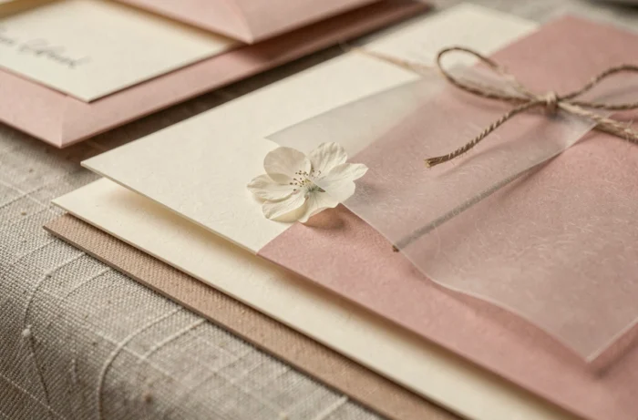
- The thick paper pocket, which contains a main card and a separate response card, adds an element of discovery upon opening without complicating the design.
- The two-fold booklet, folded in the center, allows for separating the announcement (cover) from the practical details (inside) while keeping a single item in hand.
Laser cutting, often associated with complex floral patterns, can also serve a sober design: a simple geometric frame cut along the edge of the card is enough to create relief.

The most memorable invitation is not the one that accumulates finishes, but the one where each element, from the paper to the font to the format, has been chosen for a specific reason. A well-thought-out card is recognized by touch even before being read.